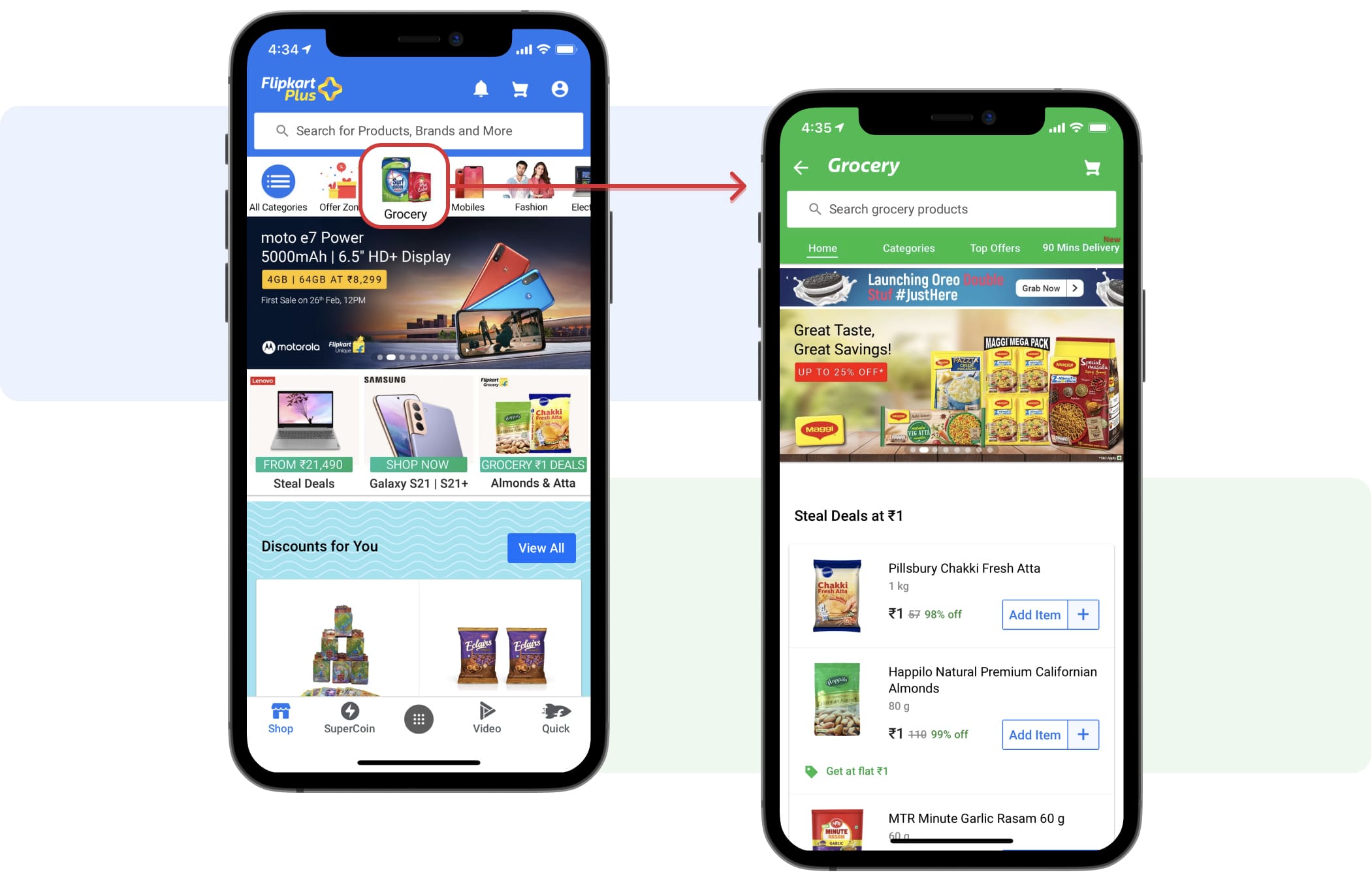
Flipkart, India’s leading e-commerce marketplace, launched ‘Flipkart Supermart’, its online grocery store, in metropolitan cities. Users can explore, build basket and purchase from a huge catalog of products ranging from Staples, packaged food, Personal care and household care. It also provides offers and delivery option to the users. Supermart is 'app in app' experience within Flipkart app and has a homepage similar to Flipkart homepage.
Flipkart users land on Supermart homepage (~80%) from different touch-points on Flipkart like browsing through categories widget or different banners on Flipkart homepage. Quantitative data suggested that there is a 40% bounce rate and 3.8% conversion rate from Supermart hompage (GHP). This leads to the hypothesis that users’ are unable to comprehend the widgets on GHP, initiate basket building or find value from current GHP. We also tapped into the data like scroll depth, widget CTRs and conversion rates of different widgets to come up with our research questions.
The goal of the study was to evaluate the Grocery homepage (GHP) on Flipkart which will help product and business teams to build GHP according to users’ needs and comprehension.
Role: User Researcher
Team members: 2 Product Managers, 2 Business Managers, 1 Product Designer, 1 creative designer and 1 marketing manager.
Timeline: 6 weeks (2020)
To comply with my non-disclosure agreement, I have omitted and obfuscated confidential information in this case study. All information in this case study is my own and does not necessarily reflect the views of Flipkart.
Gain an understanding of the following aspects:
I discussed the recruitment plan with my stakeholders to ensure that all the team members align with the recruitment criteria. Participants were recruited through a recruiting agency. A recruiting screener was shared with the vendor who provided a list of potential users, sift through the responses, schedule appropriate participants, and manage their compensation for us.
Fair mix of gender [M(12), F(12)], age group [20-45 years], working professionals (18) and homemakers (6), family size.
I conducted one-on-one interviews with 24 participants in 3 cities - Bengaluru, Hyderabad and Delhi. I used a combination of exercises to uncover research objectives.
First impressions:
This method is to elicit conversation about GHP in assessing layout considerations and information design.

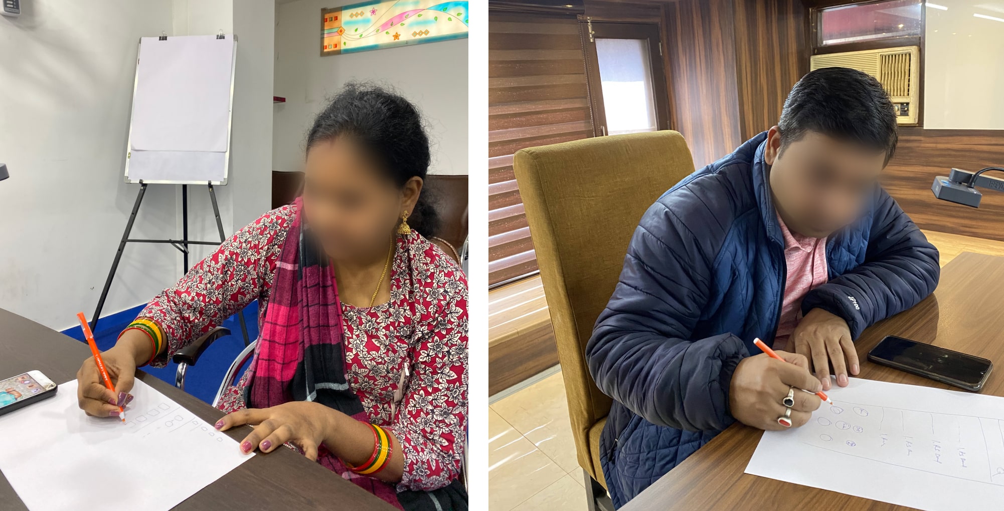
Participants participating in first impression task
Validate content comprehension, relevance and expectation from GHP:
Participants went through the grocery homepage and discussed content comprehension and relevance with respect to different widgets.
Cards activities:
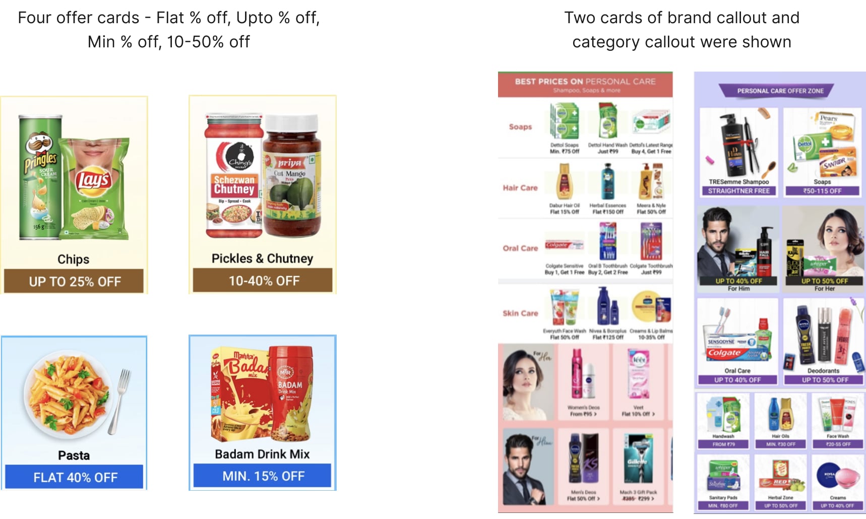
This was to assess the comprehensibility of the offer callouts.

Co-creation task:
To identify the preference of widgets on GHP.
We provided users with visual cards(cutouts), each one depicting a component of the GHP and ask them to build an GHP by re-ordering the widgets as per their preference.

Participants performing co-creation task
After each session, we had debriefing sessions with the product managers, Business managers and Designers to reflect on each session. I did my analysis with the help of atlas.ai tool by tagging individual observations and quotations with codes, to facilitate the discovery of significant themes. Some of the insights that we distilled from our synthesis are:
Rs 1 recall was strong but users expected to see variety of products in this deal.
“Here, fortune oil, I will not use at home. So if they are giving at 1 rupee also, it’s not of any use for me. Instead of that, if I get the chance of taking the brand which I like, it would have been still more interesting for me.” - P5, Bangalore
Implication: How might we provide more value to the current users?
Grocery homepage perceived to be lengthy and repetitive (products & offers) which created confusion around offers value.
“I don’t scroll so much to be very honest. This is the first time I have scrolled the page and all these things are creating confusion and it is stretched so much. It is complicating as everything is already there above.” - P3, Delhi
Implication: How might we design page which increases certainty?
Some offers titles (Flash sale, trending offers, spotlight etc) did not match users’ mental model and hence created puzzlement.
Implication: How might we display offers according to the mental model to minimise confusion?
Flipkart Plus members receive no benefit of being Plus members after shopping from Supermart.
“Flipkart me points leke membership lete hai na usse free delivery hoti hai. Woh bhi le rakhi hai tb bhi mujhe extra paisa dena padta hai delivery ke liye.” - P15, Delhi
Implication: How might we utilise plus coins in Supermart and provide benefit to plus members?
Combination of all offer types (Upto, range, Rs vs % off, etc) within a widget increases confusion in offer comprehension and selection provided
Implication: How might we provide clear distinction between offer types to exhibit significance?
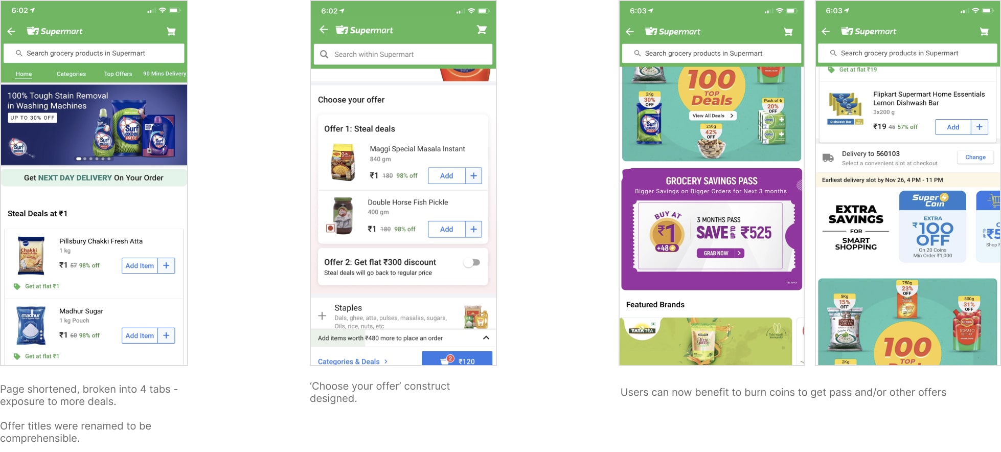
We brainstormed on research insights to execute design changes. The design changes led to decrease in bounce rate and an increase in conversion on landing page.
Some of the design changes and their impact:
